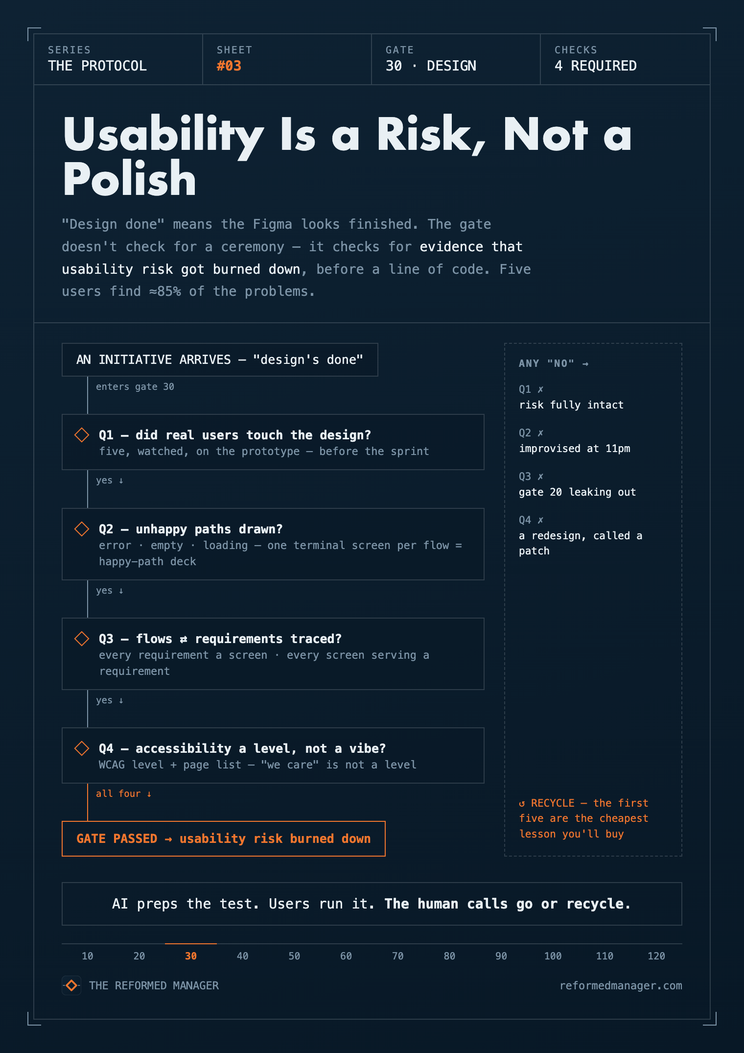
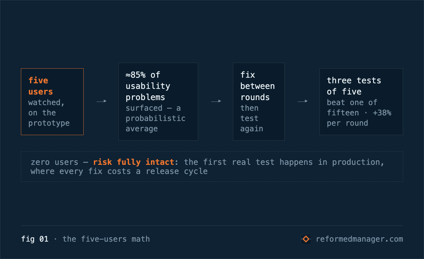
Five users find 85% of your usability problems. Most teams ship to five thousand before testing with five.
The number comes from Jakob Nielsen’s research, and it’s old enough to drink: a usability test with five users surfaces about 85% of the problems in a design — a probabilistic average, not a promise, and distinct user groups need their own five, but the deal holds. Five. Not a research program, not a quarter-long study — five people trying to use the thing while somebody watches. And the finding has a sharper edge most people miss: the payoff comes from iterating. Three small tests of five beat one big test of fifteen, because you fix between rounds. Nielsen measured that too — median usability improvement per design iteration, 38%. The number is decades old. What changed is the price of ignoring it — AI just made the wrong design cheap to build.
Now hold that number against how most teams actually run. “Design done” means the Figma looks finished. The flows cover the happy path. The demo walks the golden scenario. Then the sprint starts, the code lands, and the first real user meets the design in production — where every problem those five users would have found for free now costs a release cycle to fix. Nielsen’s line on prototype testing says it plainly: do it “before you waste money implementing something that doesn’t work.” That’s the whole gate in one sentence.
What does Gate 30 actually check?
Gate 30 in my system is Design Complete, and the name is a little dangerous, because “complete” sounds like a ceremony — a sign-off meeting, a stakeholder nod, a checkbox. So, honesty first: no canon prescribes a design-approval ceremony. Nielsen’s own doctrine — iterate in small cycles — cuts against one big blessing moment. The gate doesn’t check for a meeting. It checks for evidence that usability risk got burned down. That’s Cagan’s framing, one of his four big risks: value asks will they choose it; usability asks can they figure it out? Gate 20 burned down the first. This gate burns down the second — before a line of code.
What counts as evidence?
Concretely — the questions I ask at this gate:
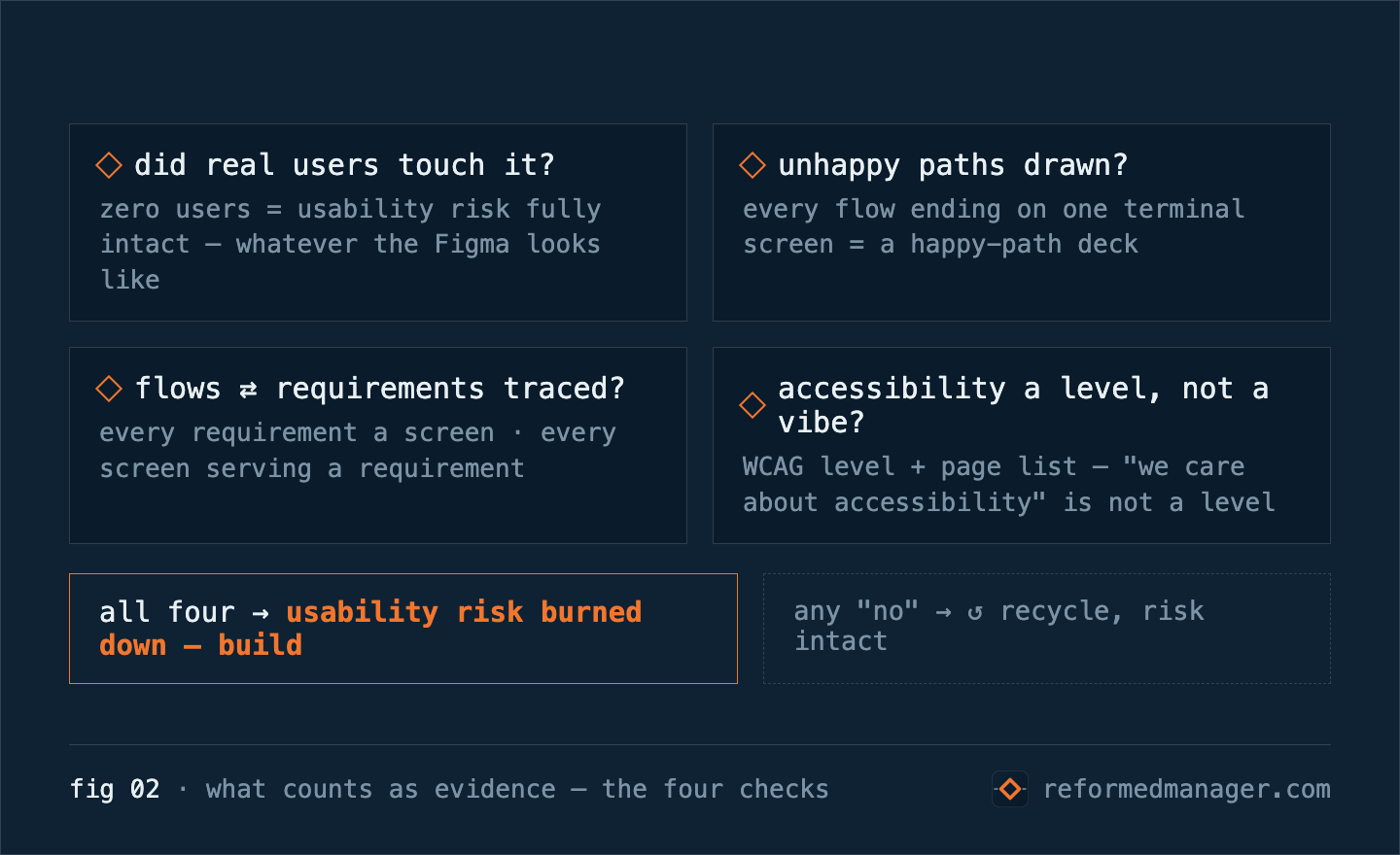
- Did real users touch the design before the sprint? A prototype test, a design sprint’s day-five interviews, five users on a clickable mock — the format matters less than the fact. Zero users means usability risk fully intact, whatever the Figma looks like. The first five are the cheapest usability lesson you will ever buy.
- Are the unhappy paths drawn? Error states, empty states, loading states, the form that fails. Quick check: if every flow in the file ends on exactly one terminal screen, you’re reading a happy-path deck. The Nielsen Norman Group names the failure mode precisely: teams get “so focused on designing or engineering the idealistic user path that deviations from that path become a frustrating afterthought.” If the error screens aren’t designed, they’ll be improvised — by a developer, at 11pm, in a branch nobody reviews for UX.
- Do the flows trace to the requirements? Every requirement has a screen; every screen serves a requirement. A gap here is Gate 20’s outcome quietly leaking out of the design. Open five requirements at random; if one has no screen, recycle.
- Accessibility and localization considered — as conformance, not intention. WCAG comes in levels (A / AA / AAA) and it’s binary per page; partial credit doesn’t exist. Ask for the level and the page list — “we care about accessibility” is not a level. It has also stopped being optional — US law now holds state and local government web to WCAG 2.1 AA, and the private-sector bar moves the same direction. “We’ll add accessibility later” means “we’ll redesign it later and call it a patch.”
What changed this year?
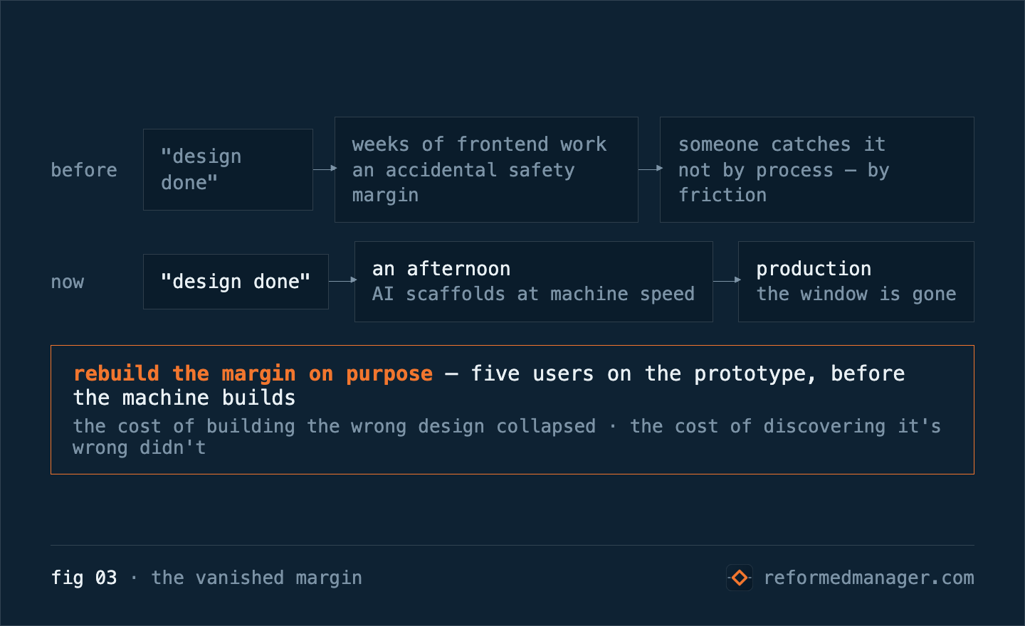
Then the amplifier — and it bites harder here than anywhere so far. AI writes UI at machine speed now: a screen scaffolded in minutes, a flow in an afternoon. Which means an unvalidated design no longer ships slowly enough for someone to catch it. The old friction — weeks of frontend work sitting between “design done” and “users see it” — was, by accident, a safety margin. That margin is gone. The cost of building the wrong design collapsed this year. The cost of discovering it’s wrong didn’t. The gate is how you put the margin back on purpose.
AI preps the test. Users run it. The human calls go or recycle.
Where does AI fit — and where can’t it?
The augmentation cuts the gate’s own cost, same pattern as the first two protocols. I don’t eyeball fifty Figma frames against a requirements doc. I hand AI both and ask for the diff: Which flows have no error, empty, or loading state? Which requirements have no screen? Which screens exist that no requirement asked for? It drafts the usability-test script while it’s at it. What AI cannot do — and this is the line — is tell you whether a human can figure it out. Only humans answer that. Five of them, watched closely, beat any model’s opinion of your design. AI preps the test. Users run it. The human calls go or recycle.
Why own this check when there’s a design org?
Because unburned usability risk converts directly into engineering rework. The “quick UX fix” that’s actually a mid-sprint redesign, the support tickets that become backlog items, the feature rebuilt one quarter after it shipped — all of it lands on the team’s velocity, not the design org’s. I’d rather sharpen the knife before the cut: five users this week, or five sprints of “polish” later. Easy to skip. Expensive to have skipped.
That’s Protocol #3. Gate 40 — Architecture Complete, where the decisions get written down before the “why” walks out the door — is next. Nine gates to go.